Buffalo Steakhouse
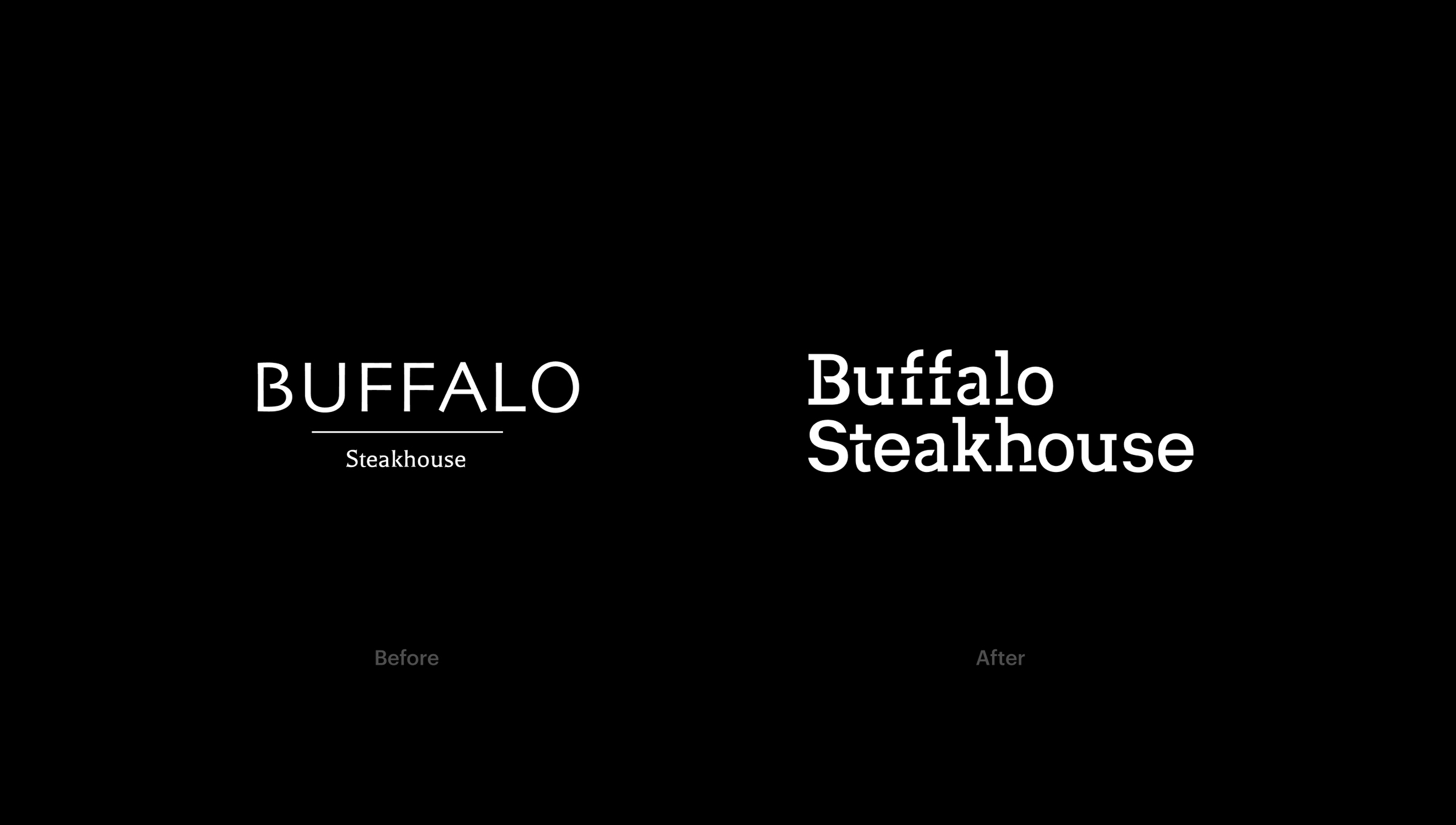
Recently after launching, Buffalo Steakhouse realised their logo wasn't unique or representative of their style and standards. They required a rebrand that would make them stand out from the crowd as well as fitting with their casual but stylish dining experience.

Their previous logo had no character or unique qualities. I created a custom slab-serif wordmark (below, right) that is memorable and professional. The strong serifs and bespoke diagonal stenciling adds a subtle representation of chopping blocks, meat knives, and steak cuts.

The brand will stick with a monochrome black, white, and grey colour scheme giving a modern and stylish feel.


The logo can be left, centre, or right aligned for various uses and is fully scalable for a variety of applications.


